You can't see UX. But it sells.
It all starts with perception
Some people call them "technical touchpoints". You find them in reports, isolate them in tests, measure them as percentages. But the truth is the game isn't won in the data. It's won in perception.
A site can be fast, tidy, consistent. But if it doesn't vibrate on the same frequency as its user, it won't sell. Design that works is design that stirs emotion. That knows where you'll look. That understands who you are before you even say it. That's where the magic happens: when what you see is exactly what you were looking for.
That said — and in parallel — there are also features, tricks and small technical workarounds that genuinely help improve an e-commerce's commercial performance.
In this article, we'll look at some of them. Not all. Just the ones that make a difference. Right away.
Speed or death
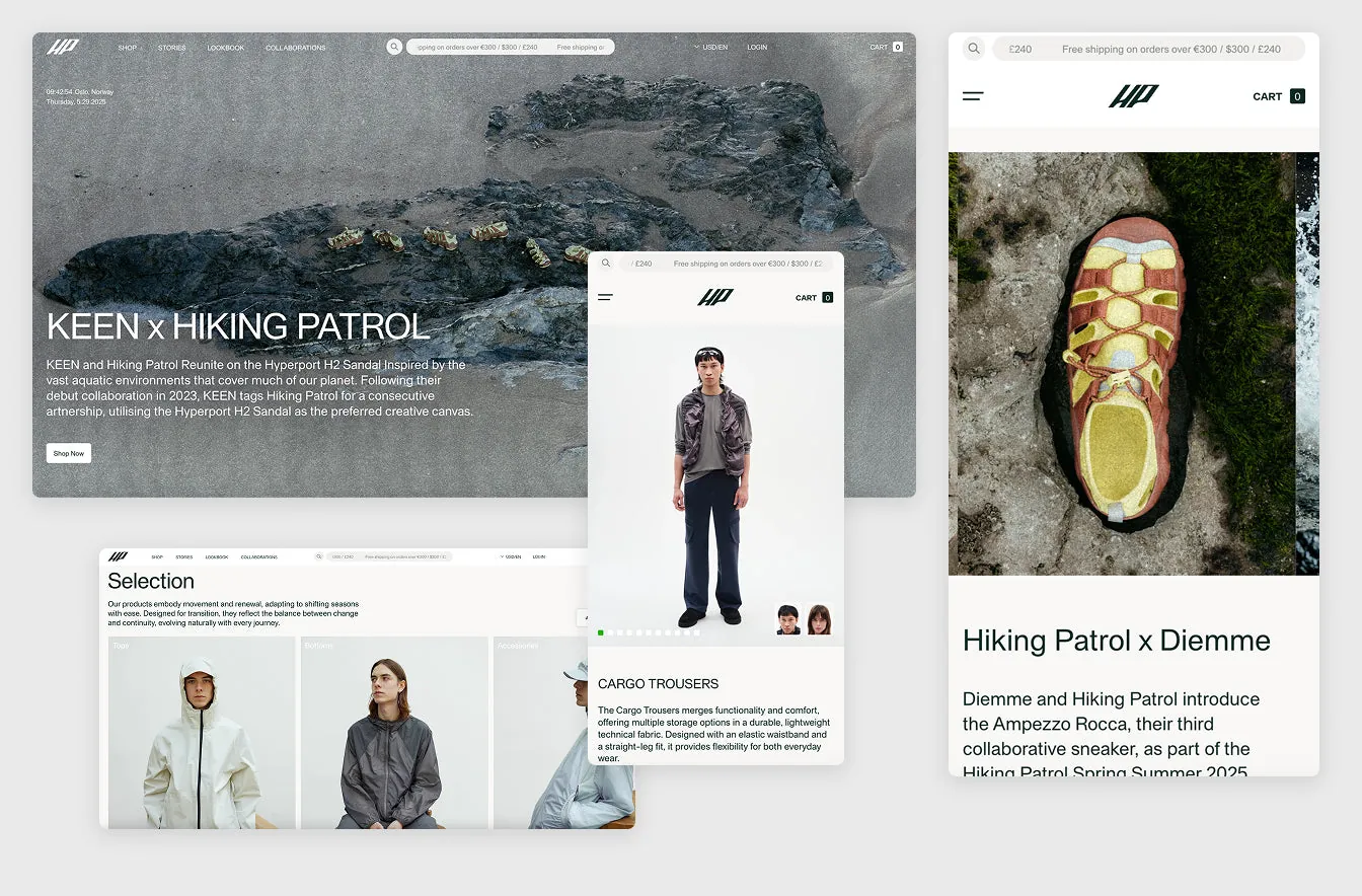
The homepage is your calling card, and in the digital world speed is synonymous with respect. A slow site communicates disorganisation, carelessness, a lack of attention to the user. Our rule: first page load under 500 milliseconds. Here's how we do it:
- All images are loaded cropped and optimised.
- Videos are lightened and loaded via lazy load.
- Priority given to above-the-fold content for an immediate perception of speed.
Add without thinking
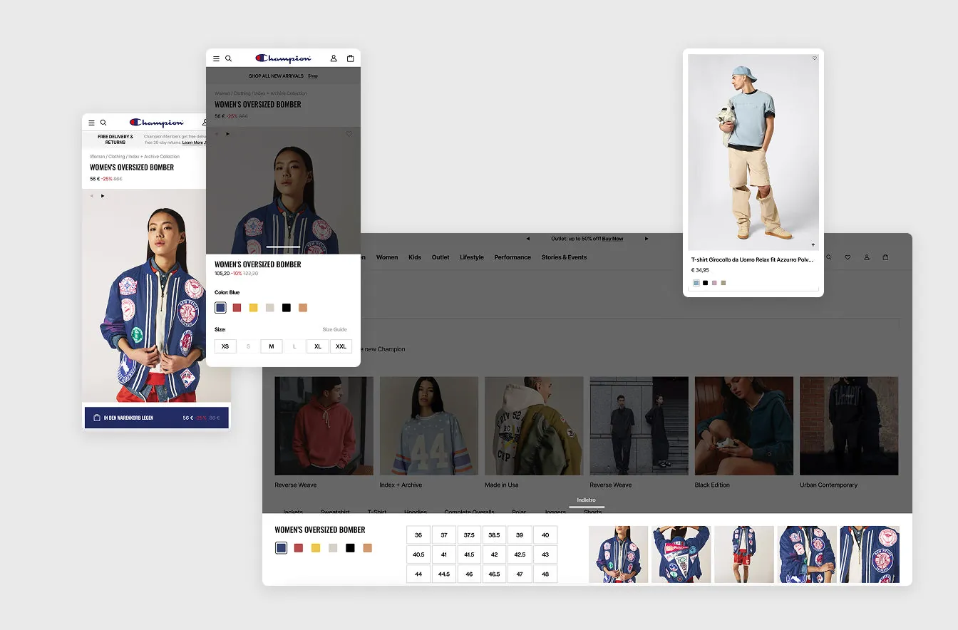
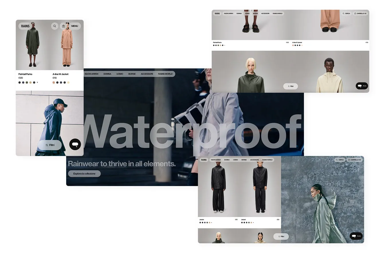
Reducing the number of clicks needed to buy is one of the most effective UX strategies. Quick Add lets users select a size and add a product to the cart directly from the listing page, without having to open the product page.
Combined with colour swatches visible on the listing page, it offers an immediate overview of the available variants. All without weighing down navigation, keeping load times low.
Few clicks, plenty of clarity
An e-commerce site that's too deep, with too many sub-categories, can create a paradox of choice that confuses the user.
Showing the main macro-categories straight away — clothing, accessories, new arrivals — creates order and immediacy.
The user knows where to go, what to expect, and feels in control.
Tell a story before you sell
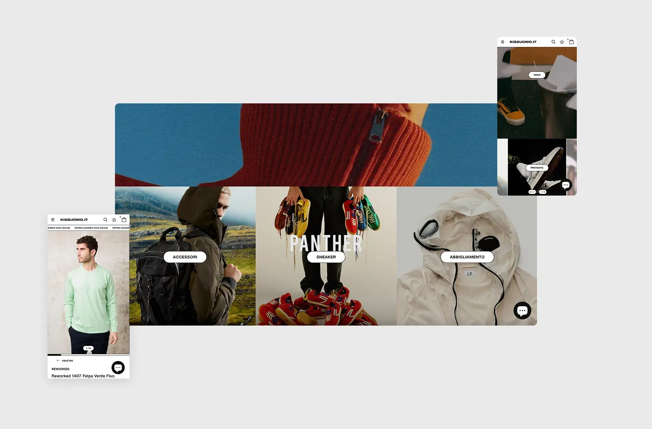
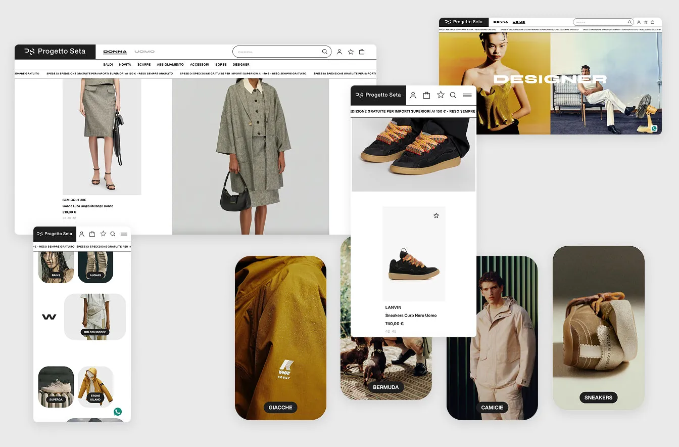
A continuous product listing can feel monotonous and "cold". Interspersing editorial images makes the flow more narrative and engaging.
It helps build brand awareness, conveys a more polished aesthetic and invites more attentive exploration.
Grids that breathe
Not all brands have the same type of catalogue. For some, a standard 2- or 3-column grid is enough; for others, you can opt for:
- A 4-product-per-row layout.
- Alternating products and visuals.
- Hybrid structures combining navigation and storytelling.
All this improves visual impact and the discovery experience.
NOTIFY ME: selling even when you're not selling
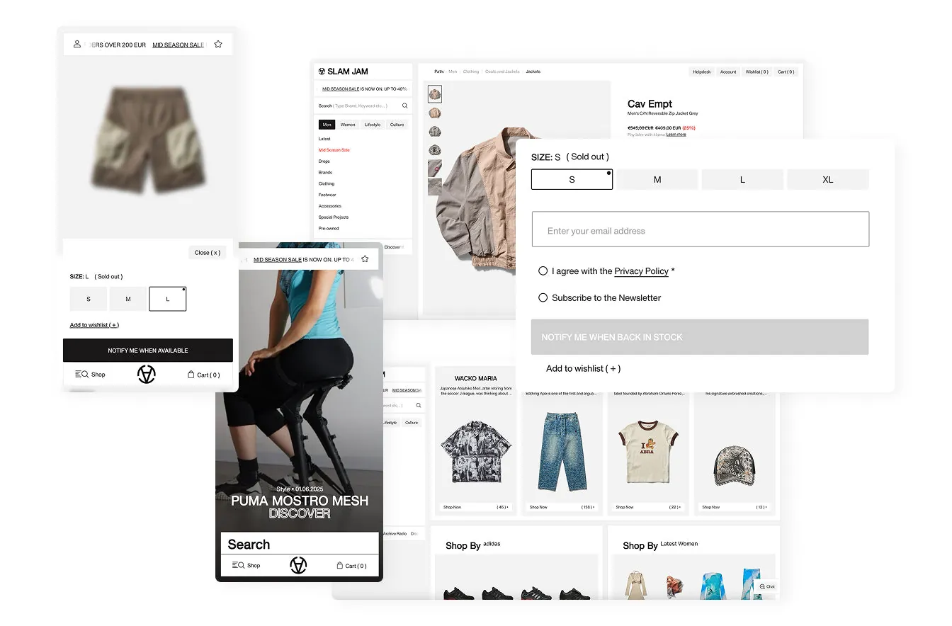
When a product is out of stock, that doesn't mean interest has ended. The "NOTIFY ME" feature lets users enter their email to be alerted when the product is back in stock. The benefits:
- You capture qualified contacts.
- You measure real product demand.
- You offer a useful, personalised service.
The product page is where the battle is won
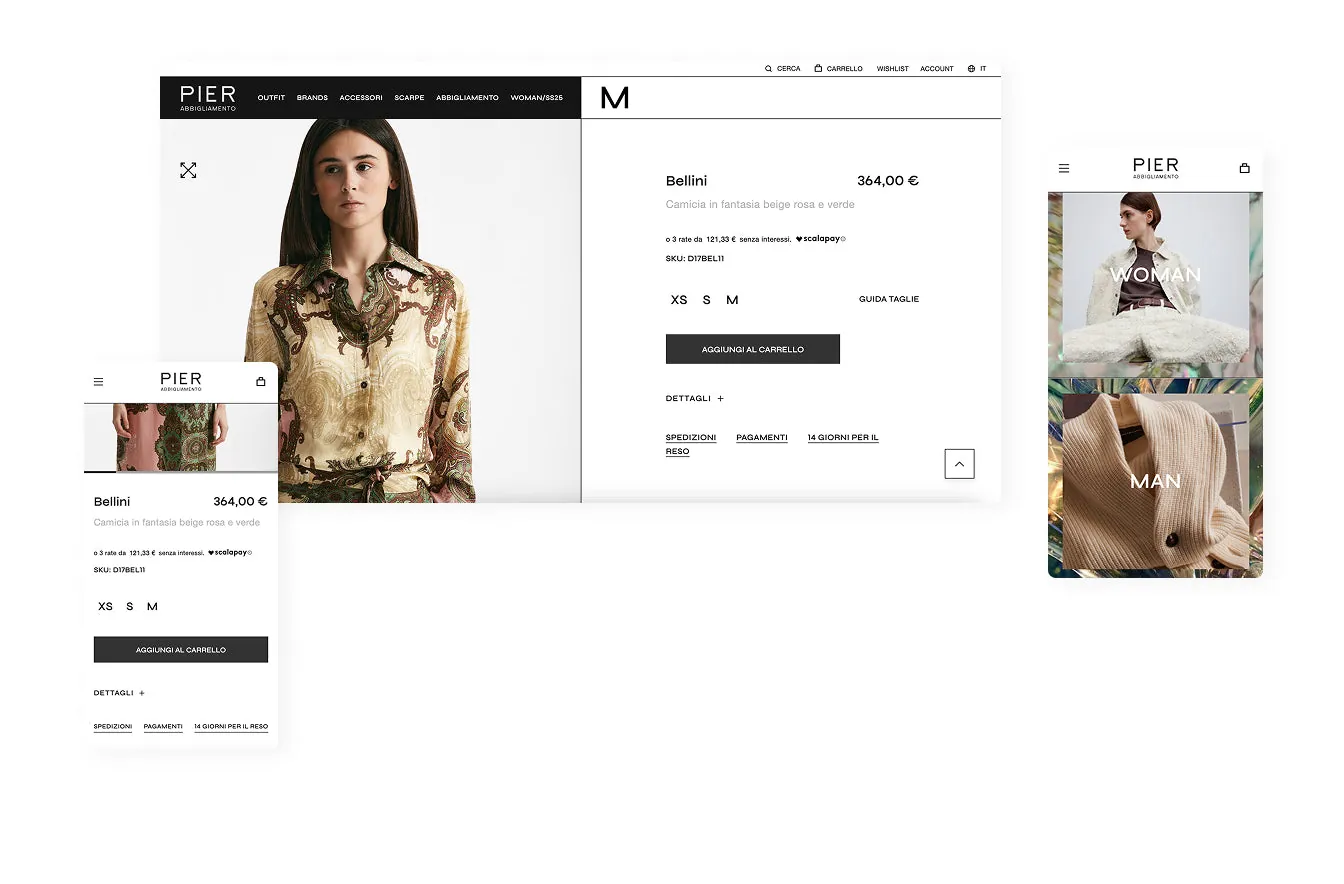
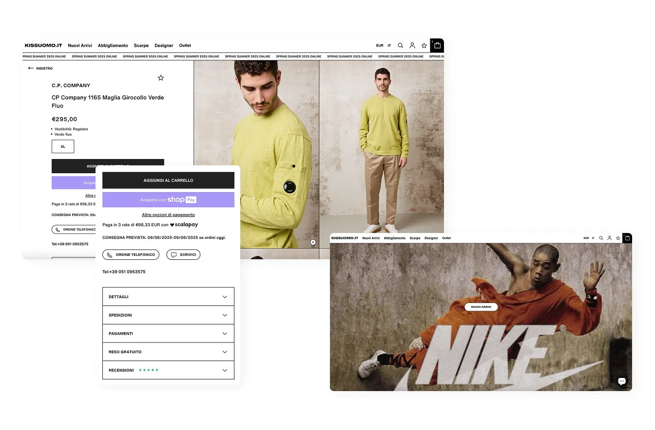
The product page (PDP) is where sales are decided. To be effective, it needs to include:
- Reviews that are visible and readable.
- Instalment payment, integrated and clearly explained.
- Expected delivery date, dynamic and up to date.
Every element reduces uncertainty and strengthens trust in the brand.
Let them get in touch. Right away.
A user with a question should be able to resolve it without leaving the site. Include on the PDP:
- A button for phone orders.
- A link to get in touch via WhatsApp or email.
It makes direct contact easier and shows attention to the customer.
A mini cart that does its dirty work
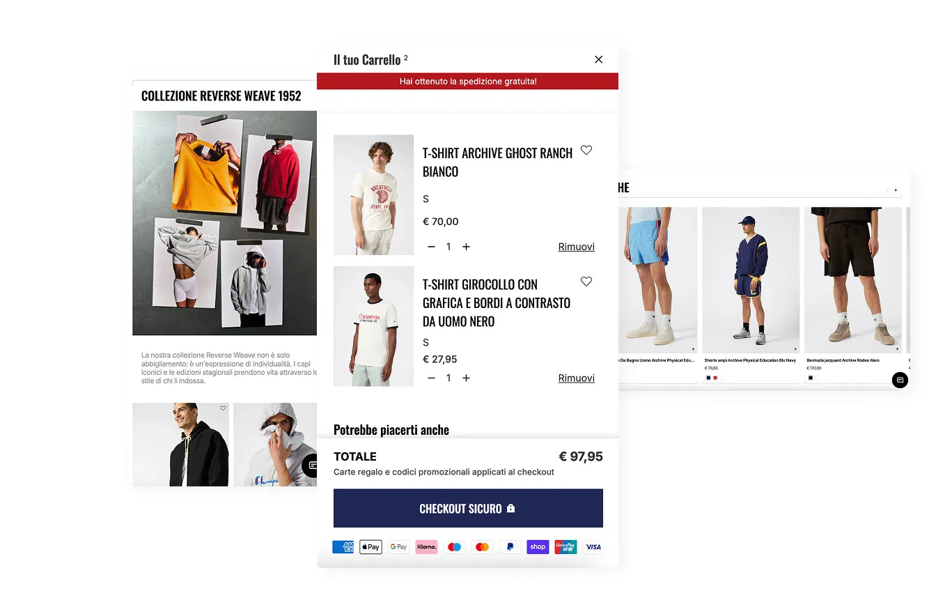
The pop-up cart (mini cart) is a strategic space that's often underrated. We can use it to:
- Include messages like: "Spend just €8 more for free shipping".
- Suggest related or complementary products at an affordable price.
All of this drives up average order value and guides the user towards checkout.
Why Shopify. Always.
All the solutions you've read above come from real experience on Shopify projects. Not by chance, but by choice.
Shopify is today the most versatile, stable and powerful e-commerce platform. It's built to scale, to integrate, to evolve. We've been Shopify Partners since 2019, and we know how to push every project to its full potential thanks to an ever-growing ecosystem.
And when design, UX and technology speak to each other, the result shows.
The end? No. The beginning.
Every detail, every click, every design choice is a bet on conversion. It's not just about making a site beautiful, but about making it right, consistent, effective. UX/UI isn't a cost — it's an invisible investment that works quietly with every visit.
If you have an e-commerce project to build, optimise or push forward, let's talk about it. This could be the right moment to make a real difference.